Unlock insights and drive performance with data visualisation
8min • Last updated on Apr 17, 2025


Olivier Renard
Content & SEO Manager
We are overwhelmed by an ever-increasing volume of information. In the workplace, an employee receives an average of over 140 emails per week. For senior executives, this figure rises to 331 (Fondation Jean-Jaurès / Archimag).
Paradoxically, this information overload harms productivity. A worker can lose up to an entire day each week just searching for the data needed to complete tasks.
How information is presented makes all the difference. The human brain processes 80% of information visually. As the saying (often attributed to Confucius) goes: “A picture is worth a thousand words.”
This is precisely what data visualisation aims to do: to regain control over information by making it digestible.
Key takeaways:
Data visualisation transforms raw data into simple, actionable visual representations.
It helps detect trends, compare results and identify anomalies. It simplifies decision-making.
Numerous no-code tools now allow for the creation of interactive dashboards and datastories. These are integral to any Modern Data Stack.
When used effectively, data visualisation improves communication, analysis, and the impact of your data.
👉 Find out what data visualisation entails, its practical applications and benefits. Learn how to choose the right tools and present your data for maximum clarity and impact. 🎯
What is data visualisation?
Data visualisation is the graphic representation of data to facilitate reading, analysis and understanding.
It can take the form of curves, charts, maps or dashboards.
It doesn’t replace data analysis, but rather enhances it. Instead of presenting information through figures or spreadsheets, data visualisation highlights the key insights at a glance.
It is also a powerful communication tool. Frequently paired with data storytelling, it helps present and contextualise information to convince and engage an audience.


Data visualisation in finance
Its benefits in business
Visualisation helps transform data into action. It speeds up decision-making, makes analyses more accessible, and encourages cross-functional collaboration.
It is particularly effective for sharing insights with non-technical teams. A well-designed chart can convey the essence of a complex dataset in just a few seconds.
It also allows for the exploration of large volumes of information to detect trends, anomalies or correlations. Different types of visualisation meet different needs.
According to the Harvard Business Review, the four main purposes of data visualisation are:
To illustrate an idea,
To generate ideas,
To explore data,
To explain results or concepts.
What types of visualisation can you create?
There are many types of data visualisations, each serving a specific purpose—comparing values, tracking change over time, analysing relationships, or improving data readability. Here's a summary of the main types:
Visualisation type | Primary objective | Common usage example |
|---|---|---|
Bar chart | Compare values | Sales volume by product |
Line graph | Track evolution over time | Monthly conversion rate |
Pie chart | Show breakdowns | Revenue distribution by channel |
Scatter plot | Identify correlations | Relationship between purchase frequency and basket size |
Geographical map | Represent spatial data | Location of customers or shops |
Histogram | Visualise variable distribution | Order value brackets |
Heat map | Highlight attention zones | Click patterns on a webpage |
Treemap | Hierarchical data breakdown | Marketing budget per channel and sub-channel |
The main types of visualisations
💡 Tools like Flourish, Tableau or Power BI offer hybrid or interactive visualisations that combine several objectives in one graphic.
There is no single “best” chart. The right one always depends on the nature of your data and the message you wish to communicate.
Dashboards, datastories and interactive reporting
Data visualisation isn’t limited to isolated charts. It can take several formats depending on the purpose.
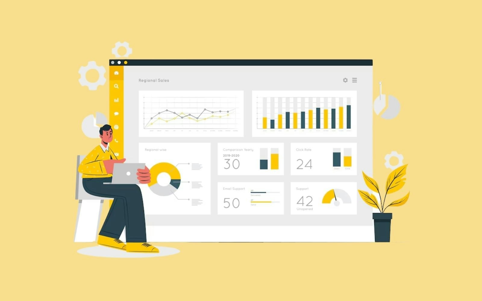
Dashboards: A performance-tracking tool that consolidates key performance indicators (KPIs) into a single, real-time view.
Among the most common dashboards: number of qualified leads generated per channel, performance of current advertising campaigns, etc.
Datastories: Visuals are arranged in logical order to explain a trend or convince an audience.
For example, presenting the outcomes of a marketing strategy, or changes in user behaviour.
Interactive reporting: A hybrid format allowing users to interact with the data via filters, menus, or hover features.
The reader becomes an active participant in the analysis and can customise the view to meet their needs.
Common use cases include analysing performance by region or product, or exploring a contact database using personalised criteria.
")
Interactive map (Source: Apache Echarts)
Building effective visualisations
As we've seen earlier, data visualisation must serve a clear purpose: highlighting insights, trends or anomalies. Start by asking: what is the best visual to communicate my message?
Choosing the right visual
The type of graph or tool depends on what you're showing. Each visual model serves a specific objective:
Comparing values = Bar chart
Tracking change over time = Line chart
Showing breakdowns = Pie chart or histogram
Illustrating relationships = Scatter plot
A poor choice of visual can lead to confusion rather than clarify the key message.
👉 For instance, a pie chart becomes unreadable with too many similar-sized categories. A horizontal bar chart is often more appropriate.

")
Unreadable pie chart (Source: Reddit)
Best practices and common pitfalls
To be effective, a visualisation must be clear, simple, and quickly understandable. Keep in mind:
Prioritise clarity: avoid unnecessary 3D effects, multiple fonts, or overly complex graphics that obscure the message.
Structure information: Use clear titles, proper legends and well-defined axes.
Create visual hierarchy: Highlight key information using contrast, colour or size.
Stay consistent: Use the same scales, colours and units across charts.
Test your chart: Ask someone unfamiliar with the context to interpret the message without help.
Tools and use cases
Whether you're an analyst, marketer or developer, there are tools designed to meet your needs. Here are the main solutions by category:
Category | Main purpose | Key tools |
|---|---|---|
Business Intelligence (BI) | Build interactive dashboards from various sources | Power BI Microsoft), Tableau (Salesforce), Looker Studio (Google), Qlik Sense |
No-code storytelling | Create interactive visuals without coding | Flourish, Toucan Toco, Metabase, Datawrapper |
Developer data visualisation tools | Custom visualisations in apps or websites | D3.js, Vega, Apache ECharts |
Data visualisation tools
💡 Practical applications
Marketing & Sales: Monitor campaign performance, visualise conversion funnels, or identify retargeting segments. The needs are varied, as data lies at the heart of decision-making.
Tools such as Looker Studio or Flourish make it possible to create clear, action-oriented dashboards that can be easily shared between marketing and sales teams.
Finance
Data visualisation helps track the evolution of key indicators: revenue, margin, profitability, forecasts.
Power BI is ideal for aggregating data from multiple sources and generating robust, custom reports.
A key component of the Modern Data Stack
In a modern architecture, data is centralised in a data warehouse, acting as a single source of truth. It's collected, transformed, and stored for use across the organisation.
Data visualisation plays a crucial role in this value chain. It makes data understandable and actionable. It delivers clear insights to all teams: marketing, sales, product, and finance.
💡 As a marketing decision-maker, imagine a user behaviour visualisation reveals a high-potential segment or a churn signal. You want to take action and launch a tailored campaign based on this insight.
This is where Reverse ETL comes into play: it allows you to activate data directly from your data warehouse into your business tools (CRM, ads, email platforms...). DinMo simplifies this step by connecting your tools to activation channels, turning data into real business impact.
Conclusion
Data visualisation is a key component of the Modern Data Stack. It transforms raw data into clear, actionable insights. It enhances understanding, encourages collaboration between teams, and most importantly, supports effective decision-making.
To unlock its full potential, it is essential to choose the right tools and take a structured approach.
👉 Go from dashboards to action. With DinMo, learn how to activate your data with zero technical complexity in a best-of-breed setup.
FAQ
What is the role of artificial intelligence in data visualisation?
What is the role of artificial intelligence in data visualisation?
Artificial intelligence (AI) enhances data visualisation by making it more powerful and automated. Some tools incorporate algorithms that suggest the most appropriate chart types based on the data, or automatically detect trends, anomalies, and correlations.
This saves time and improves the relevance of the insights provided. AI can also simplify the creation of interactive dashboards by generating visuals from natural language queries.
When combined with a modern data stack, it enhances analysis, improves clarity, and supports more effective performance management. AI is becoming a powerful ally in presenting data clearly, smoothly, and in an actionable way.
What makes a good data visualisation chart?
What makes a good data visualisation chart?
The purpose of your chart is to convey information that is clear, easy to interpret, and helpful in supporting decision-making. It should highlight a trend, a comparison, or an anomaly without overwhelming the viewer.
The type of chart should match the message: a pie chart for simple breakdowns, a bar chart for comparing values, a line chart for tracking changes over time. Effective data visualisation relies on visual simplicity, consistent colour schemes, well-defined axes, and clear labelling.
The goal isn’t to impress, but to explain. In a business context, a good chart helps the viewer understand the data at a glance, enabling faster and more confident action.
How should you choose your data visualisation tool?
How should you choose your data visualisation tool?
It depends on your objective, technical level, and data environment. For commercial or marketing use, no-code tools like Flourish, Looker Studio, or Toucan Toco allow you to create clean dashboards quickly.
For more analytical or financial needs, tools like Power BI or Tableau offer more advanced processing capabilities. Developers may prefer D3.js or Vega to build fully customised visualisations.
It’s also essential to ensure compatibility with your existing data stack, especially your data warehouse. A good data visualisation tool should support analysis without adding complexity to your workflows.
Why should data visualisation be part of every marketing strategy?
Why should data visualisation be part of every marketing strategy?
Data visualisation transforms business data into actionable insights. By visualising campaign performance, user journeys or conversion funnels, it's easier to spot what’s working and what needs improving.
Dashboards help teams track the right KPIs, detect early signals, and respond quickly. Integrated into a data-driven strategy, data visualisation fosters alignment between marketing, sales and product teams.
It also improves communication of results and supports strategic decisions. In short, it makes data more accessible, easier to understand, and more valuable in day-to-day operations.
*Source : Archimag